Let the product do the talking.
River Island
UX Designer, UI Designer
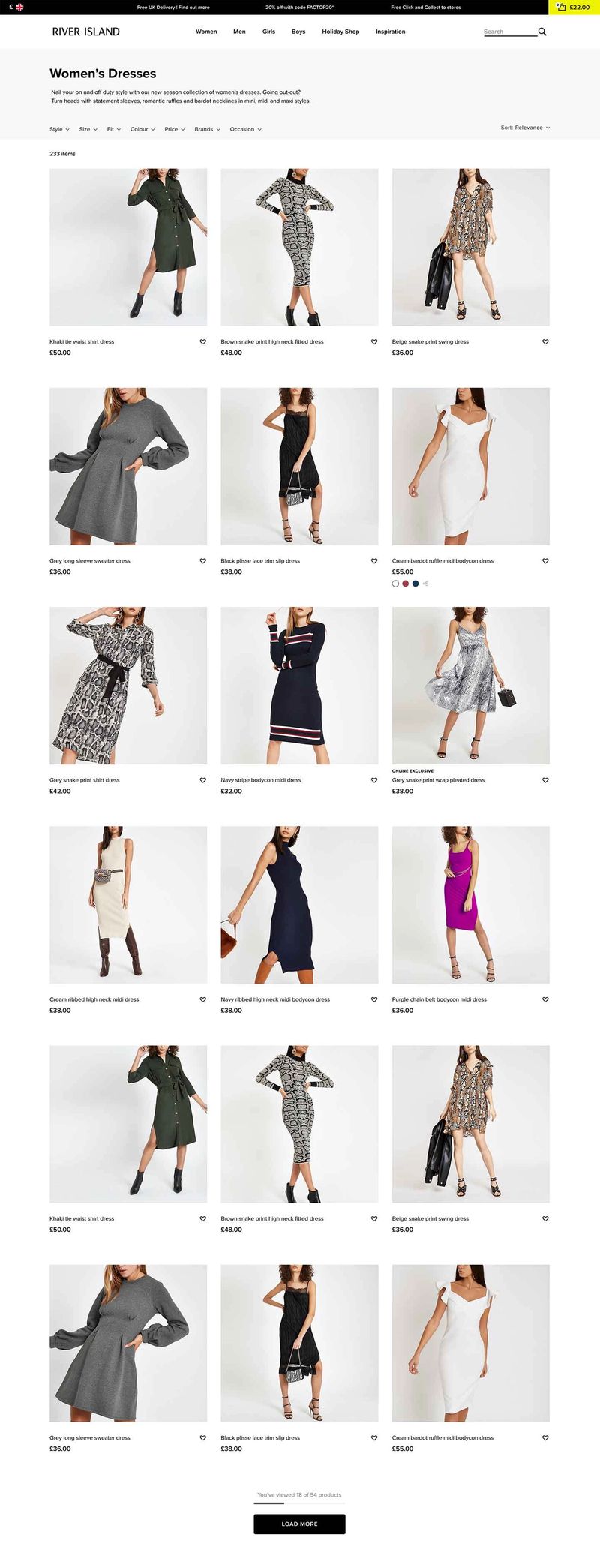
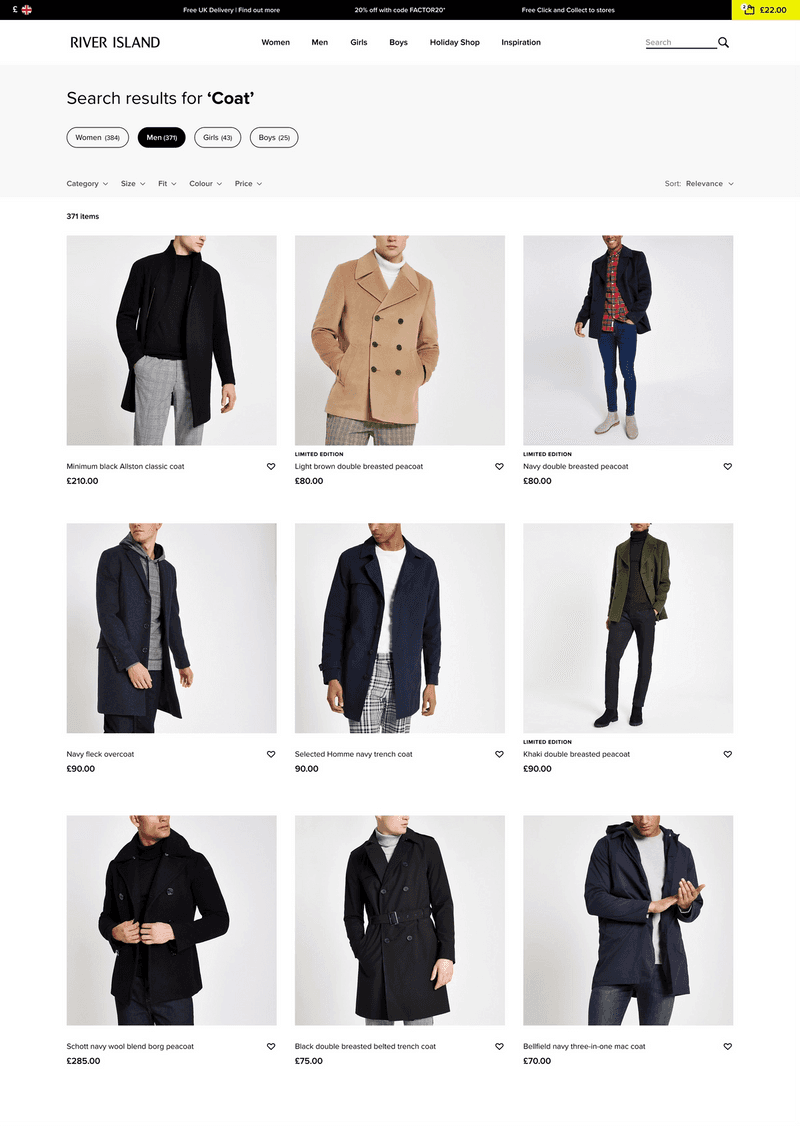
Creating a more engaging and intuitive product listing page. Giving users the confidence to navigate River Island's extensive product collection.

River Island's website has thousands of products for users to navigate. The design of the product listing page is key to allowing users to find and discover items of clothing they like.
Initial user testing highlighted some key areas of improvement, these included – Too much visual noise impaired users' ability to easily focus on the products, the small size of the product tiles on larger screen devices made it difficult to compare products and filtering was often frustrating and cumbersome.
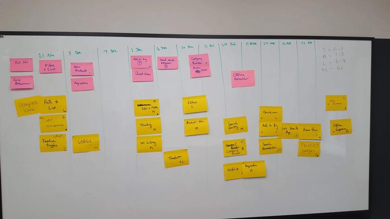
As a cross-functional team, we ranked the issues that came out of the research and quantitative data we had and then planned out a rough roadmap, taking account of technical requirements and additional user research sessions we would need to validate proposed solutions. The roadmap was subject to change, but we mitigated the chance of big changes interfering with development by prioritising the areas we had the highest confidence in and having frequent 'early developer check-ins' to understand any technical complexities that the new solutions could bring.


